You’ve seen it happen.
A brilliant app idea, a solid development team, a big launch and within weeks, users vanish. Ratings fall, retention drops, and that “next big thing” turns into another forgotten icon on someone’s phone. It’s not the idea that failed, it’s the experience.
That’s where UI UX design becomes your biggest competitive edge. A clean, intuitive interface and thoughtful user journey can turn casual users into loyal fans.
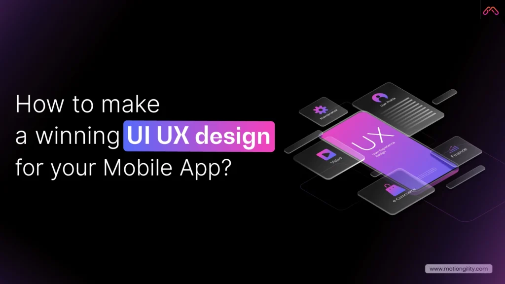
In this guide, you’ll learn how to create a winning UI UX design for your mobile app, one that users don’t just download… they actually enjoy using.
What Is UI UX Design and Why It Matters for Mobile Apps
Before you even think about colours, buttons, or animations, you need to understand what UI UX design really means, and why it decides whether your app wins or dies.
Now, here’s why this matters more than ever: A Forrester study found that a well-designed user interface can boost conversion rates by up to 200%, and a better UX design can raise those rates by up to 400%. That’s the power of thoughtful design.
On mobile, attention spans are brutally short; the average user decides whether to stay or leave an app in less than 3 seconds.
If your mobile application UX design feels slow, cluttered, or confusing, you’ve already lost them. Good design doesn’t just “look nice.” It removes friction. It guides the eye. It creates flow. And it builds trust, the invisible emotion behind every successful product.
Whether you’re a startup founder, a marketer, or hiring a mobile app UI UX designer, remember this: users don’t fall in love with features.
They fall in love with how easy and pleasant your app feels to use. That’s the magic of strong application UI UX design, it turns functionality into an experience people actually care about.
Common Mistakes That Kill Your Mobile App’s UI/UX

Let’s be honest; most apps don’t fail because of a lack of innovation. They fail because the user experience is broken. When people download an app, they expect it to “just work.” If they have to think twice about what to do next, they’re gone.
Here are the biggest UI/UX design mistakes that drive users away and how you can fix them.
1. Unclear User Flow
Ever opened an app and thought, “Wait… what am I supposed to do here?” That’s a broken user flow. When screens don’t guide users naturally from one step to the next, they get frustrated.
Fix it:
- Map out your entire app journey before writing a single line of code.
- Use flowcharts or storyboards to visualise how users move between screens.
- Test with real people, not your design team. Fresh eyes expose confusion faster than analytics ever will.
Good mobile application UX design feels invisible: users move from task to task without thinking.
2. Weak Visual Hierarchy and Inconsistent Design
If your colours, fonts, and buttons look like they belong to three different brands, users lose trust instantly. Visual inconsistency makes even the smartest app feel amateur.
Fix it:
- Build a design system: consistent colour palettes, typography, spacing, and button styles.
- Stick to a single visual language across screens.
- Remember: contrast guides attention. Use it strategically to highlight what matters most.
A clean, consistent user interface design for mobile applications builds familiarity, and that breeds loyalty.
3. Cluttered Screens and Complex Interfaces
More features don’t always make your app better. Too many elements crowd the screen and overwhelm users.
Fix it:
- Focus each screen on a single goal.
- Use white space generously.
- Hide secondary actions until they’re needed.
This is where professional App UI design services shine; they know how to make complexity feel simple.
4. Slow Performance and Lag
No one likes waiting. A slow, unresponsive interface destroys trust and retention.
Fix it:
- Compress images and optimise assets.
- Minimise transitions that delay screen rendering.
- Test performance on real devices, not just simulators.
Remember, performance is part of UX.
5. Ignoring Accessibility
Accessibility isn’t optional; it’s smart design. If your app doesn’t cater to everyone, you’re turning away potential users.
Fix it:
- Maintain high color contrast and readable font sizes.
- Ensure buttons are large enough for all users.
- Support screen readers and voice navigation.
Great UI UX design companies don’t design just for the majority; they design for everyone.
When you avoid these five mistakes, your app becomes more than usable; it becomes enjoyable. And enjoyment is what keeps users coming back. As Steve Jobs famously said, “Design is not just what it looks like and feels like. Design is how it works.”
Core Principles of a Winning Mobile App UI/UX

Here’s the thing: great design isn’t about trends or fancy animations. It’s about how your app feels when someone uses it. If your app looks beautiful but frustrates users, it’s a waste of pixels. Good UI UX design is simple. It helps people get from point A to point B without stopping to think, “What do I do next?”
That’s what separates an app people delete from one they recommend to their friends. So, what makes an app feel right? Here are the principles every designer and founder should live by.
1. Clarity — Keep It Obvious
Users don’t have time to figure things out. Every icon, button, and label should make sense instantly. When the navigation is clear, people relax. When it’s not, they quit. Clarity is about removing guesswork. A clean, predictable layout helps users move through your app like it’s second nature.
That’s the heart of great mobile UX design, it’s invisible but powerful.
2. Consistency — Familiar Feels Trustworthy
You know how you can open Spotify or Instagram after months and still know exactly what to do? That’s not luck. That’s consistency. When colours, spacing, and actions behave the same way across your app, people feel comfortable. Familiarity builds trust. Trust builds retention.
If you’re working with a mobile app UI UX designer, make sure they think about consistency early. It’s one of those details that makes your product feel professional without users even realising why.
3. Feedback — Always Close the Loop
Ever tap a button, and nothing happens? That tiny moment of uncertainty ruins the flow. Humans need confirmation. A small animation, a gentle vibration, a checkmark, anything that says, “Hey, your action worked.” It’s subtle, but it changes everything.
Those tiny details separate average apps from the ones people actually enjoy using.
4. Speed — Because Nobody Waits Anymore
Design isn’t just visual. It’s functional. And part of the function is speed. If your app lags, people bounce. Simple as that. The best application UI UX designs make performance part of the process. Trim unnecessary steps. Load what matters first. Let design support performance, not slow it down.
A fast app doesn’t just feel good, it earns trust
5. Accessibility — Design for Every Hand, Eye, and Mind
Not every user interacts the same way. Some rely on voice. Some need larger text. Some use one hand while commuting.
Ignoring that isn’t just a missed opportunity; it’s exclusion. A strong UI UX design company thinks beyond “average” users. It builds for everyone.
Contrast, readable fonts, clear icons, voice controls – all of it adds up to a smoother, kinder experience. Accessibility isn’t an extra feature. It’s part of being user-centred.
6. Emotion — The Real Secret Sauce
You can’t measure emotion on analytics, but you can feel it. It’s that moment when an animation feels satisfying.Or when the tone of a message sounds human instead of robotic. Good design makes people smile without them realising why.
And once your app connects emotionally, users don’t just use it, they remember it.
When you strip away buzzwords, this is what real design looks like: clarity, consistency, feedback, speed, accessibility, and emotion.
And as these principles evolve with new technologies, they’re shaping the future of UI UX design, where AI, personalisation, and predictive experiences are becoming the new standard. If you get these right, your app won’t just work, it’ll stick.
How to Create a User-Friendly Mobile App Interface (Step-by-Step Guide)

If there’s one thing that separates successful apps from the ones people delete in a week, it’s this: clarity. You don’t need fancy animations or a massive feature list. You need an app that feels effortless: something people can use without thinking twice.
Here’s how to design a mobile app UI UX that users actually enjoy.
1. Start With Real User Research
Before you touch a single pixel, understand your users. Talk to them. Watch how they interact with similar apps. Learn what annoys them. You’ll uncover insights that no analytics dashboard can show you.
This step is the foundation of good UI UX design. Every decision that follows: layout, visuals, navigation – should come from what real people need, not what you think looks cool. That’s what separates a true UI UX design company from a team just making screens.
2. Map Out the User Journey
Design isn’t just about individual screens; it’s about how those screens connect. Sketch the flow: what happens after signup, how onboarding feels, where users go next.
When you see that journey on paper, you’ll spot the dead ends and friction points. Great mobile application UX design moves the app to feel natural; no hesitation, no backtracking, no “where am I?” moments.
3. Build Wireframes Before Visuals
Think of wireframes as the skeleton of your app. They’re not about colors or icons; they’re about structure. Wireframes let you test logic early and catch problems before design polish hides them.
Every professional App UI design service starts here because it saves time, cost, and confusion down the road. This stage is also where modern teams increasingly use intelligent assistants and automation, leveraging some of the best AI tools for UI UX design.
4. Design for the Thumb Zone
Here’s a quick reality check: most people use one hand to operate their phone. That means your primary buttons, like “Next,” “Add to Cart,” or “Submit,” should be within thumb’s reach, not buried at the top.
This tiny detail transforms the comfort of your app. The best mobile app UI UX designers always think about ergonomics as much as aesthetics.
5. Use Visuals That Guide, Not Distract
Good visuals aren’t decoration; they’re direction. Colour should highlight what matters. Typography should be readable, not trendy. And spacing? It’s your silent tool for creating focus.
Every part of your user interface design for mobile applications should lead users toward their goal, not pull them in different directions.
6. Test Early, Test Often
The biggest mistake most teams make? Waiting too long to test. You don’t need 100 users. Five honest testers will expose more problems than a month of internal reviews.
Watch how people use your prototype. Do they pause? Do they tap the wrong thing? Those moments tell you exactly what to fix. That’s why experienced UI UX companies test constantly, not at the end, but at every stage.
7. Keep Improving After Launch
Launching your app isn’t the finish line; it’s version one. Study analytics. Track where users drop off. Update layouts, tweak navigation, and refine visuals.
Even small UX improvements can lift engagement and retention dramatically. The best application UI UX designs evolve with their users. Treat design like a conversation, not a one-time project.
A user-friendly mobile app doesn’t just happen; it’s built through understanding, testing, and refinement. When your design feels natural, people don’t notice it, and that’s the point. They just use your app, enjoy it, and keep coming back. That’s what every startup wants and what smart UI UX design makes possible.
Why Partnering with MotionGility Is the Smart Move for Mobile App UI/UX Design
When it comes to UI UX design, most teams focus on how an app looks. MotionGility focuses on how it works. Our designers start with real user research: mapping journeys, removing friction, and building interfaces that feel effortless. That’s why our mobile app UI UX design services for startups don’t just look great; they improve engagement and retention.
With experience across SaaS, fintech, and eCommerce, MotionGility blends creativity with data to create experiences that drive results. As a full-service UI UX design company, we handle everything from research to handoff, keeping design consistent and fast.
If you’re serious about building an app users love, MotionGility is the best UI UX design company for mobile apps that turns ideas into smooth, scalable products.
Conclusion
Building a mobile app that people love isn’t luck; it’s design done right. When your UI UX design focuses on clarity, flow, and emotion, everything changes. Users stop struggling and start engaging.
From intuitive layouts to smooth navigation, every pixel should serve a purpose. And if you want that balance between beauty and usability, MotionGility’s UI/UX design services give your app the best chance to succeed.
Because great apps aren’t just built, they’re designed to connect, convert, and last.