You’ve spent thousands on driving traffic to your landing page. Visitors are coming… but they’re not converting.
Sound familiar?
Here’s the thing: a pretty landing page isn’t the same as a high converting landing page.
There’s a difference, and honestly, that distinction is costing you money every single day.
A high converting landing page combines strategic design, compelling copy, and psychological triggers to turn visitors into customers.
But, how do you design such landing pages that convert? Before getting into this, let’s first understand:
What Makes a Landing Page 'High Converting'?
A high converting landing page makes more people take action than the average page in your industry.
We’re talking about pages that consistently convert at 10% or higher, while a recent study by Wordstream reveals the average landing page conversion rate across all industries is just 2.35%.
Think about it: if you’re driving 1,000 visitors monthly and move from 2% to 10% conversion, you’ve just 4x your results without spending another dollar on traffic.
But here’s what most people get wrong: they think it’s all about the design.
But the truth is, landing page conversion depends on three core elements working together:
- Psychology (understanding what motivates your visitor)
- Clarity (making it so simple to take action)
- Trust (proving you’re worth the risk)
Using these three elements, you can create the best landing pages for conversion, and there’s a step-by-step process for that.
Let’s discuss what it is:
How to Design a High Converting Landing Page (Step-by-Step)
1. Understand the Goal of Your Landing Page
Here’s your first rule: one page must have one purpose.
Your landing page isn’t your homepage. It’s not trying to do everything for everyone.
Whether you want signups, downloads, purchases, or demo requests, you need to pick one goal and design everything around it.
Every design decision should support that main objective.That means you should remove navigation menus because they’re escape routes, and pull out any sidebar links from your page.
Even in complex projects that might also involve dashboards or admin templates, the landing page should stay focused on a single conversion path.
Keep in mind that your landing page is a funnel, not a website.
2. Craft a Compelling Copy That Converts
Your headline will have just 3-4 seconds to grab attention, so ensure to write something engaging and grabbing.
And your copy should tie directly back to whatever brought the visitor to your page. If they clicked an ad about “doubling productivity,” your headline better mention productivity, not some generic benefit.
Here’s the formula for writing better landing page copy:
- Headline: Big benefit for the user.
- Subheadline: How do you deliver that benefit
- Value Proposition: Why you’re different (your USP)
Instead of “Welcome to Our Software Platform,” you can try “Double Your Team’s Productivity in 14 Days (Without Overtime).”
As you can see, the second one creates a specific and measurable promise that speaks to a real pain point.
3. Focus on Clean, User-Centered Design
Minimalist design isn’t just trendy; it converts better.
When visitors land on your page, their eyes should naturally flow toward your most important elements, and that can be achieved by creating a great UI/UX design for your landing page.
Here’s how to structure your landing page layout for maximum impact:
")
Above the fold:
- Compelling headline
- Supporting image or video
- Primary CTA button
Below the fold:
- Social proof
- Feature/benefit breakdown
- Secondary CTA
- Trust signals
Use size, color, and contrast strategically. Your CTA button should be the most prominent element on the page.
To design it, you can think of bright colors that contrast with your background.
4. Use Video for Better Conversion
Multiple sources found that landing pages with video can increase conversions by up to 86%.
Why? Because video builds trust faster than text. It shows your product in action, puts a face to your brand, and keeps visitors engaged longer.
Video Sales Letters (VSLs) are particularly powerful for higher-ticket offers. Instead of making visitors read through the benefits, you can demonstrate them in real time.
For instance, after embedding a short explainer video on one of our clients’ landing pages, they got over 4,000 video interactions in a short time.
The data shows that on average, each user rewatched or viewed multiple parts of the video about 8 times, showing user engagement and conversion potential.
")
Using a simple 60-second explainer video can dramatically improve your landing page conversion rate. Just make sure it loads fast and works on mobile.
5. Include a Strong & Benefit-Focused CTA
Your call-to-action button is where conversions happen, yet most people completely mess this up.
Here’s an example showing how to make your CTA compelling:
- Bad CTA: “Submit”
- Good CTA: “Download Free Guide”
- Great CTA: “Get Our Productivity Blueprint”
Can you see the difference? Its specificity and benefit.
Your prospects don’t want to ‘submit’, but they want to get something valuable.
You can use action words for your CTA like “Get,” “Download,” “Start,” “Unlock,” or “Access.” These types of words create momentum and urgency.
6. Leverage Trust Builders
Nobody wants to be the first person to try something. That’s why everyone on the internet needs social proof, and that’s one element for conversion.
Here’s what you can include on your landing page:
- Customer testimonials with photos and names
- Client logos (especially recognizable brands)
- Case studies with results
- User reviews and ratings
- Security badges and guarantees
Here’s a tip: Place testimonials just before your secondary CTA (that’s below the fold).
When someone’s about to convert, that’s when doubt comes into their mind, but a well-placed testimonial can push them over the edge.
Trust signals like SSL certificates, money-back guarantees, and industry certifications reduce friction and increase confidence.
7. Optimize for Speed, Mobile, and SEO
Here’s the reality: 53% of mobile users abandon sites that take longer than 3 seconds to load.
So, if you’re planning to design a high converting landing page, it needs to be fast.
In today’s digital scenario, mobile optimization isn’t optional but a necessity. More than half of your traffic is probably from mobile, so your page needs to look great and load quickly on small screens.
Also, SEO drives free traffic to your best landing pages, so ensure you get the best SEO services in the market.
Plus, here are some SEO basics for landing pages:
- Include the primary keyword in your title tag and H1
- Sprinkle relevant keywords for your product/service throughout the content
- Optimize images with alt text (also include the keywords here)
- Keep your meta description between 120 and 160 characters
Landing Page Best Practices That Actually Work
Here are the landing page best practices you can follow to separate your brand/product/services from the competition:
- Always lead with value. Your visitors should understand what’s in it for them within 5 seconds of landing on your page. If they won’t find any value, your bounce rate will increase sharply.
- Speak to the pain points directly. Don’t assume your customers know they need your solution, so agitate their problem and then position yourself as the solution.
- Break your content into digestible sections as you’re dealing with scanners, not readers. So, use subheadings, bullet points, and white space.
- Repeat your CTA strategically. Include it above the fold, in the middle of your content, and at the bottom. But don’t overdo it.
- Focus on benefits, not features. People don’t care about your “advanced algorithm”—they care about saving time, making money, or solving problems.
- Personalization matters, so using dynamic content when possible, like location-based offers, returning visitor messaging, and personalized recommendations, can boost conversions significantly.
- A/B test everything with Google Analytics or platform-specific software. Test headlines, CTA buttons, colors, images, and copy for improvements in your landing page conversion rate.
- Check which sections of your landing page are winning. Use tools like Hotjar to know what part of the page is engaging the user the most, so you can similarly optimize other sections.
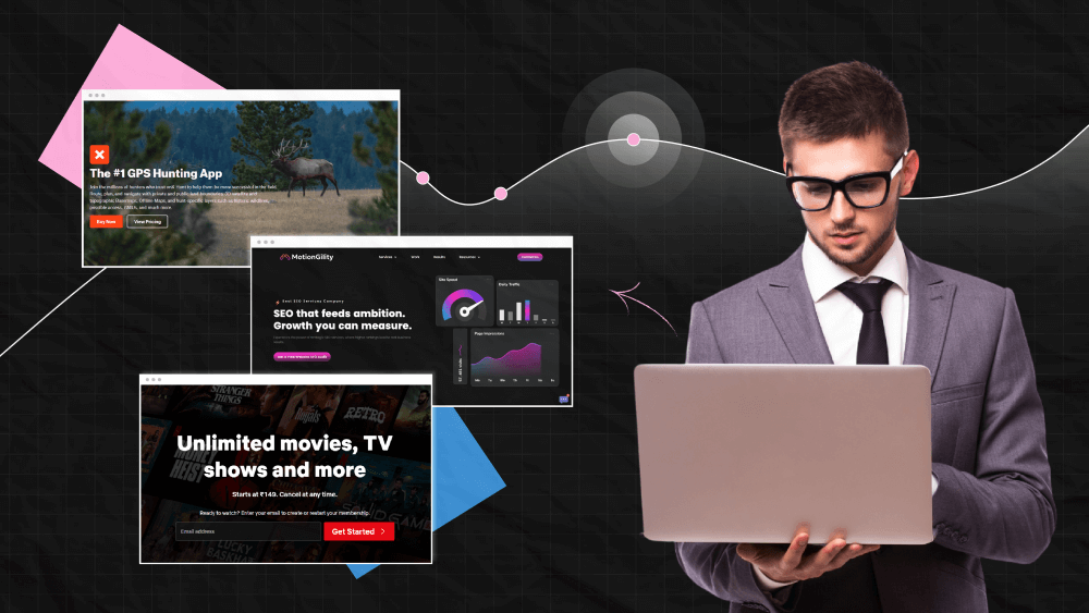
Best High Converting Landing Page Examples
Let’s look at what works in the real world with some high converting landing page examples:
1. onX GPS Hunting App
")
The onX GPS Hunting App landing page achieves a 61.15% conversion rate by focusing on a clean layout, compelling visuals, and a direct value proposition for its target audience – hunters and outdoor enthusiasts.
The page showcases app features, uses high-quality imagery, and maintains a laser focus on the core CTA.
2. Extreme Lounging
")
While the exact conversion rate for Extreme Lounging is not public, it is described as “blush-worthy” and very high. The landing page uses a single image, headline, and a CTA, pulling out all distractions.
This simplicity, combined with a compelling incentive, drives exceptional conversion for the furniture brand.
3. Netflix
")
Netflix’s landing page is cited across multiple industry roundups as a model for high converting landing pages.
Netflix’s approach is direct: a headline offering unlimited access, a bold CTA, and a “Cancel anytime” message to reduce friction.
The design is clean, with minimal copy and a strong focus on the signup action.
Can you notice the pattern among all the above examples? Each page has a single focus, a clear value proposition, and minimal distractions.
That’s all you need to design the best landing pages for conversions.
Conclusion
Creating a high-converting landing page isn’t about following a template; it’s about understanding your audience, removing friction, and building trust.
The difference between a 2% and 10% conversion rate often comes down to details: the right headline, strategically placed testimonials, or a more compelling CTA.
Remember: your landing page is a strategic investment, not just a pretty design. When done right, it’s your best salesperson, working 24/7 to turn visitors into customers.
If you agree with us on this point, then you’ll be glad to know that we’ve helped SaaS companies, agencies, and e-commerce brands create landing pages that convert at higher rates.
Our approach combines conversion psychology, data-driven design, and relentless testing to maximize your ROI.
So, if you aren’t against designing a high converting landing page for your brand or product, you can contact us here.