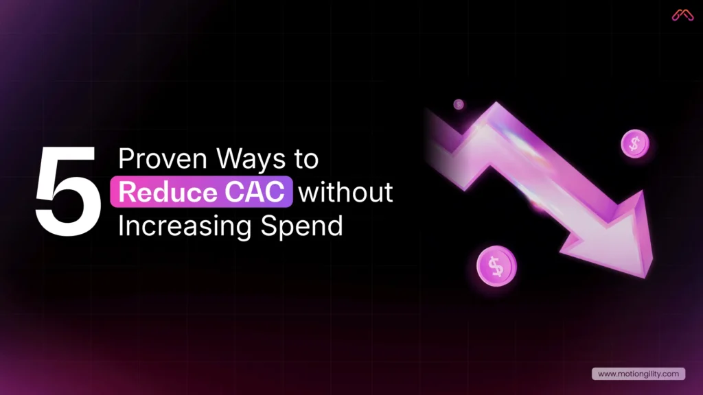
In SaaS, getting new customers is tough. Keeping them? Even tougher. Customer churn is the biggest challenge SaaS companies face today. You can spend heavily on ads, sales calls, and campaigns, but if users leave faster than they arrive, growth doesn’t just slow down, it stops.
Here’s where most teams slip up: they chase new features, hoping the next update will impress. But while they’re busy building, they forget about the experience customers have when actually using those features. And that experience depends on one thing UI UX design.
If your product feels clunky, if the navigation is confusing, or if onboarding takes longer than a Netflix episode, users don’t stick around. They cancel. They churn. And churn, my friend, is the silent killer of SaaS growth.
Here’s a scary stat: acquiring a new customer costs five to seven times more than keeping an existing one (Harvard Business Review). Yet so many SaaS companies pour money into ads, sales, and partnerships—while their product design quietly drives customers out the back door.
Think about it: you might have the most powerful tool in your industry, but if users can’t figure it out in the first five minutes, they won’t care. They’ll go find a competitor whose app “just works.” That’s why UI and UX design isn’t just about making things look pretty, it’s about reducing customer churn and boosting long-term growth.
In fact, Bain & Company found that improving customer retention rates by just 5% can increase profits by 25% to 95%. Now imagine what happens when you reduce SaaS churn by 200%. That’s not just an improvement, that’s a growth engine.
So in this guide, we’re going to break down how an engaging UI UX design slashes churn rates, what specific design choices matter most, and how you can use them to turn frustrated trial users into loyal customers who stick around for years.
Understanding SaaS Churn Rate
Let’s keep this simple. Churn rate is the percentage of customers who stop using your product over a given time period.
Here’s the formula:
Churn Rate = (Customers Lost During Period ÷ Customers at Start of Period) × 100
That’s it. No fancy math.
For example: If you started the month with 1,000 customers and 50 were canceled, your churn rate is:
(50 ÷ 1,000) × 100 = 5%
See how easy that is?
Now, here’s why that number matters. In SaaS, even a “small” churn rate adds up fast. If you lose 5% of your customers every month, by the end of the year you’ve lost nearly half your entire base.
And according to a report, mature SaaS companies usually keep churn between 5% and 7% annually. But if you’re an early-stage startup, brace yourself 10% to 15% churn is common.
Here’s the kicker: replacing those lost customers is painfully expensive. Harvard Business Review found it costs five to seven times more to acquire a new customer than to retain an existing one.
So if your UI UX design makes people leave, you’re not just losing subscription revenue—you’re burning marketing dollars too. That’s why the fastest-growing SaaS companies treat churn like a fire alarm, and they use design as one of the most effective tools to put it out.
Why UI/UX Matters More Than Features
Let me ask you something. Have you ever tried a software tool that bragged about having “all the features you’ll ever need”… only to quit using it because the experience was a nightmare?
That’s exactly what happens to SaaS products every single day. Companies pour months of work into building advanced features, but they forget one simple truth: if the product feels hard to use, those features don’t matter.
This is where UI/UX design comes in.
Think of UI design as the look and feel—the buttons, colors, typography, and layout. UX design is how it all works together to create a smooth journey. And when both are done right, users don’t have to “figure things out.” They just get it. If you’re unfamiliar with how these fundamentals work, it helps to revisit UI UX design basics to understand why small experience flaws can trigger big churn.
Here’s the scary part: users are impatient. Research shows 88% of people won’t return after a bad user experience (Toptal). That means you could lose almost 9 out of 10 potential customers, not because your product lacks power, but because your UI/UX experience frustrated them.
On the flip side, Forrester found that a well-designed UI can boost conversion rates by up to 200%, while an improved UX can lift conversions by as much as 400%. Those aren’t vanity numbers. That’s revenue. That’s retention.
So why does UI and UX design matter more than features? Because features don’t keep users—experiences do. A product with fewer features but a delightful design will always outperform a feature-packed product that feels clunky.
And here’s the kicker: churn often has nothing to do with what your product can do. It has everything to do with how your product makes users feel while they’re doing it.
4 UI/UX Design Factors That Reduce Churn

So, how does UI UX design really cut down your churn rate? Let’s keep this simple. There are four areas where design makes or breaks retention. Miss these, and people leave. Nail them, and customers stay.
1. Navigation and Simplicity
Ever opened an app and thought, “Where the heck do I click?” That’s bad design. People don’t want to dig around like they’re solving a puzzle.
Clear menus. Obvious buttons. Straightforward flows. When navigation feels natural, users relax. And when they relax, they stick around. That’s how you lower SaaS churn without adding a single new feature.
2. Onboarding Experience
Onboarding is your first impression. Blow it, and customers won’t give you a second chance.
Here’s a stat that’ll make you sweat: 63% of users say onboarding decides whether they’ll keep using a product (Wyzowl).
That means if your sign-up flow drags on or your walkthrough feels like homework, you’re handing churn a free win.
Instead, give people a quick win. Show them the value in minutes. A friendly tooltip, a short welcome video, even a progress bar they all guide users to that “aha” moment faster.
3. Consistency Across Devices
Here’s a pet peeve of mine: a mobile app that looks nothing like the desktop version. It’s confusing. It breaks trust.
Consistency in UI and UX design matters. Fonts, colors, layout, interactions—it should all feel familiar. Whether your customer logs in on their laptop or their phone, the experience should be seamless. That’s what a good UI UX design agency delivers.
4. Creativity and Engagement
Function matters. But let’s be real—people also want products that feel good to use.
Little things—animations, micro-interactions, personalized dashboards—make software less boring. Slack nails this. Their
playful messages and smooth UI/UX services keep teams coming back every day. Engaged users don’t churn. Period.
These four areas—navigation, onboarding, consistency, and creativity—aren’t “nice-to-haves.” They’re survival strategies.
Get them right, and you’ll see churn plummet. Ignore them, and you’ll watch frustrated users quietly leave for your competitors.
Case Studies: Proof That Design Reduces Churn
You might be thinking, “Alright, sounds good in theory. But does UI/UX really cut churn in the real world?” Let’s look at a few examples. These cases don’t just highlight what works today; they also hint at the direction the future of UI UX design is heading, where simplicity and clarity will matter more than features.
Slack: Engagement by Design
Slack didn’t become the go-to team tool just because it offered chat. Plenty of apps did that. What set Slack apart was UI UX design that made work feel… fun.
-
- Clean layout.
-
- Colorful interface.
-
- Playful micro-copy like “You’re all caught up.”
And the results back it up. Slack’s churn rate for paid teams has been reported at less than 1% monthly, far below the SaaS average (Business of Apps). A big reason? Their onboarding flow. Roughly 30% of users become daily active within the first week, simply because the product is easy (and enjoyable) to start using.
That’s customer churn reduced through design—not luck.
Dropbox: Simplicity Wins
Dropbox could have turned file storage into a mess. Instead, they nailed UI and UX design from day one.
The interface was so simple that you didn’t need a manual. Drag, drop, sync—done. That frictionless experience is why Dropbox spread like wildfire. People weren’t leaving because it “just worked.” A classic example of how SaaS UX design slashes churn.
The Flip Side: Clunky Enterprise Tools
Before Atlassian redesigned Jira in 2018, it was known for being powerful but painfully complex. Dashboards were cluttered, navigation was messy, and new users often gave up before they saw any value.
The result? Teams started switching to simpler tools like Trello and Asana. That’s customer churn in action—not because Jira lacked features, but because the UI UX design made people frustrated.
Once Atlassian simplified Jira’s UI UX experience, retention improved. Proof that even industry giants lose users when design gets in the way.
Common Mistakes That Drive Churn

Here’s the truth: most SaaS companies don’t lose customers because their product is bad. They lose them because of avoidable design mistakes. Let’s call them out.
Mistake #1: Making It Pretty but Not Usable
Some founders fall in love with flashy visuals. Bright gradients, cool animations… all good. But if the UI UX design sacrifices usability, customers get annoyed. Beauty without clarity = churn.
Mistake #2: Ignoring Mobile
We live in a mobile-first world. If your mobile app feels like an afterthought, users notice. An inconsistent UI and UX design across devices breaks trust and pushes people to competitors.
Mistake #3: Skipping Onboarding
You only get one first impression. A clunky sign-up flow or confusing onboarding kills adoption. No adoption? Hello, customer churn.
Mistake #4: No Feedback Loops
Design isn’t “set it and forget it.” If you’re not listening to customers through surveys, heatmaps, or usability tests you’re designing in the dark. That almost always leads to higher SaaS churn.
Mistake #5: Overloading Features
Adding more features doesn’t fix churn. In fact, it often makes it worse. Users don’t want “everything.” They want the right things, delivered through simple UI/UX services that feel effortless.
Avoid these traps and you’ll already be ahead of half the market. Because fixing churn isn’t about doing more—it’s about doing design smarter.
How to Pick the Right UI/UX Design Agency

Here’s the deal: not every UI UX design agency is worth your time (or money). Some agencies focus on making things “look cool” but completely miss the point—reducing customer churn.
So how do you find the right partner? Let’s break it down.
1. Look at Their Portfolio
Don’t just skim screenshots. Dig deeper. Have they worked with SaaS products? Better yet, do they have examples of helping companies cut SaaS churn or improve retention through UI and UX design? Results matter more than pretty mockups.
2. Ask About Their Process
A solid UI UX design company doesn’t start with colors and fonts. They start with research. User interviews, behavior tracking, usability tests—that’s how they figure out why customers leave. If an agency can’t explain its process, that’s a red flag.
3. Check Testimonials and Case Studies
A good UI/UX agency should have real client stories, not vague praise. Look for numbers—reduced churn rate, improved activation, higher engagement. Proof beats promises.
4. Look for a Balanced Team
Design isn’t just UI. It’s UI and UX design working together. Make sure they have strategists, researchers, and developers, not just visual designers. Otherwise, you’ll end up with a “dribble shot” that looks good but doesn’t move the needle.
Picking the right UI UX design services partner isn’t about who has the flashiest portfolio. It’s about who can help you keep customers. Because the right agency won’t just design screens—they’ll design retention.
Conclusion
Most SaaS teams don’t lose customers because of missing features. They lose them because poor UI UX design makes the product frustrating to use. A smoother experience lowers the churn rate, increases retention, and drives growth. In competitive markets, the winners aren’t those with endless features, but those whose design keeps customers coming back.
FAQs
1. What is UI design and UX design?
UI is the interface—the buttons, menus, and visuals. UX is the bigger picture—the path a customer takes and how smooth that journey feels. One without the other leaves gaps.
2. How does UI/UX influence churn?
When the product feels complicated, customers leave faster. A clear, well-structured experience reduces friction and gives people reasons to stay.
3. Can UI/UX really reduce churn rate by 200%?
Yes. Companies that simplify workflows and streamline onboarding often see retention double or even triple. Slack is a great example—they keep paid churn under 1% a month.
4. Why should SaaS companies hire a UI/UX design agency?
An external team brings perspective, research, and structure. A good UI/UX agency doesn’t just make screens look nicer—it builds systems that lower churn.
5. How do I know if my current UI/UX is working?
Check the numbers. If users don’t finish onboarding, avoid core features, or cancel early, that’s usually a design problem more than a feature problem.